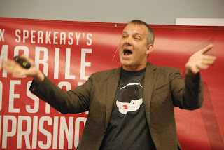
In looking over my notes from the MOB'dUP conference Saturday I notice several interesting themes and a heck of a lot of good quotes. I am going to share just a few. And then I am going to give you a small task to test your ability to implement some of the tools and techniques learned at the conference.
Theme: Frustration. No, I don't mean conference attendees were frustrated. Quite the opposite. However, bleeding through many of the talks was evidence that UX professionals feel they have a tough row to hoe. Whether sharing strategy to outwit a corporate mindset that thinks that because mobile devices are small, the budget for mobile UX should be equally small (theme picked up in Greg Zapar's talk) or that there is inherent antagonism between developers and designers (themes included in talks by Guy Meyer and Asa Williams - bios in here), I sensed a certain amount of angst.
"Being a _____ just doesn't cut it anymore" [fill in the blank with just about any traditional job title]
"We aren't artists; most of what we do is Business Design" [said in the context of a rude awakening]
"I sometimes think designers go to the color wheel and just point and pick - every time. So you never get the same color twice" [said by a developer with great frustration]
Theme: Non Linearity. If ever the dominance of the Waterfall Method of doing anything was gone, it was Saturday. Just as OOP greatly displaced imperative programming, and parallelization is now de rigueur, speakers were drop kicking any lingering notion any audience member might have had that design and development were sequential activities. Designers and developers were exhorted to work together from start to end. Designers were exhorted to become more technical. Crossing boundaries, blending perspectives, eliminating silos.
"The designs are finished. All you have to do is implement it" [Does anyone actually fall for that line anymore?]
"Be nice to your Developer. They work really hard to make it perfect" [Encouraging the manifestation of compassion in a frustrating world]
Now, for your challenge. It has to do with overcoming suffering. Because this is most definitely not what you want your users experiencing.
Setup: Despite the overall presence of non linearity, there was one particular linearity, found in Chad Martin's talk, that I really glommed onto. The "Delight vs. Frustration Map". This is an incredibly practical and useable technique for charting the story of an experience. Either predicted or completed.
Put on your UX Designer creativity hat and intuit the storyline that your software created that resulted in this Delight vs. Frustration timeline:
Got it?
Now here is the actual storyline as it took place:
1. (bright and early morning): Boot up computer
2. Launch browser - notice it seems a bit slow to come up
3. Attempt to log in to mail - it is really slow
4. Attempt to read mail - painfully slow
5. Give up on mail and try to join video conference
6. Give up on video conference and attempt to send email explaining absence
7. Telephone colleague
8. Colleague suggests running a Speed Test
9. Make coffee while Speed Test application loads
10. Run Speed Test with anticipation
11. Get results: Download speed: .04 Mb/s; Upload speed: .10Mb/s
12. Try to reach Cable company online
13. Give up and telephone cable company. Have a pretty good interaction with support desk.
14. (Bright and early the next day): Cable guy comes over
15. Cable guys cleans up exterior wiring apparently messed up during recent renovations
16. Computer is faster
17. Cable guy finds other unrelated technical problems that are outside his purview.
18. Enjoy chatting with cable guy anyway. Cable guy then leaves.
19. Make coffee and get on with the day
Your Challenge:
What would you do to help your user to raise those Frustration ratings and transform them into Delight?


