Computing and people who work with computers are not the nerdy and negative images often portrayed in the media. As a computer scientist, educator and project evaluator with my hands and feet in many fields I live these realities every day. I am like the kid who never stops asking “why?” In this blog, I share my questions and curiosity about the interdisciplinary role of computing with a special concern for how computing can make the world a better place.
Thursday, February 7, 2013
Family Feud UX Speakeasy Style
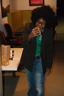
My jaw dropped when I looked up and saw Michael Jackson coming down the stairs last night at the monthly San Diego UX Speakeasy meeting. For real. I mean I know MJ passed away a few years ago but this was him, for real....
I gawked all night. I suppose I shouldn't have been surprised, because this group always manages to have a good time. I was already sporting a large mustache courtesy of the organizing committee. To show what I know about wearing a mustache, I had been about to place it on upside down until a guy wearing a sparkly tiara pointed out my error.
All part of the Girls vs. Guys Family Feud themed meeting (an offbeat acknowledgement of Valentines Day month).
Of course, there was plenty of learning last evening. Activity #1 for the gender-split teams: you have 2 minutes to use your mobile phones to research your assigned UX celebrity/author and report back to the whole group.
I was very pleased to see that there were an equal number of men and women on the list:
A. Cooper D. Chiswell
JJ Carret J. Tidwell
J Kolko K. Goodwin
T. Zaki Worfel I. Young
L. Wroblewski G. Bell
R. Unger S. Wachter-Boettcher
Do you know who each of these people is?
Do you know what each person authored?
Do you know which is the list of women and which is the list of men?
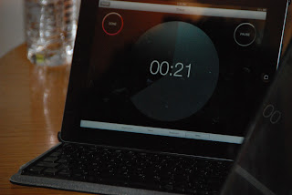
Talk about a great warm-up exercise. Then it was on to the real contest. A series of UX questions designed to get each team thinking - but only 60 seconds to come up with one best answer. Michael Jackson kept the contestants honest and on time with his iPad.
Ready to test yourself?
Q. What might the color green represent on an icon or button?
Q. What is the most commonly used mobile application, either pre-loaded or down-loaded, in the United States?
Q. Name a way to encourage your team to think creatively.
Q. Where might you find a company logo other than on a website?
Q. Name a research method that can be used to create or improve the information architecture on a website.
Q. Name something that is normally fond on the home page of a website.
Q. Name one way to make text salient on a computer screen without changing the font size.
Q. How many licks does it take to get to the center of a tootsie pop?
Q. What is another word for customer?
Q. Name a product or feature you will most likely see and be designing for in the home of the future.
The crowd became increasingly enthusiastic, with plenty of shouting out, contesting the decisions of the judge, and there were reports of some teams ignoring the clock. There were some particularly interesting graphical answers - meaning via the use of pen and markers. One contestant told me this was because she was so inspired by the recent Sketchcamp that now she feels empowered to sketch, draw and doodle in places she never thought of before.
Pink and blue tiaras glittered in the spotlights, mustaches peeled under the force of cognitive sweat.
And the answers are...
Subscribe to:
Post Comments (Atom)


No comments:
Post a Comment